
Box

In the hierarchy of objects, Wireframe Box is derived from the paragraph widget from the text controls.
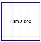
If you remove border and background from the box widget and add text to it then it is exactly same as default paragraph widget.
Using Box and paragraph widgets, you can accomplish major portions of your UI mockups.
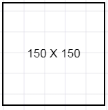
Placeholder Box used within Wireframe app
Placeholder boxes are used to quickly fill up space in your wireframes. It could be a placeholder for some image, text or any other widget that is not decided at the time of design.
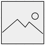
Image Box
Image box represents any image you would like to use in the wireframe. Useful for mocking galleries or portfolio show case.
Map Box
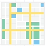
This is a SVG map widget to indicate either a Google map or other map. You can combine and place any icon on the map to indicate address or location.
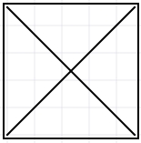
Banner Box
Same as box except this displays the dimensions of the box as you stretch the borders.
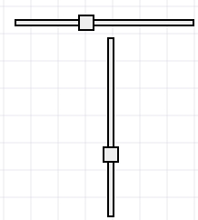
Horizontal Spec
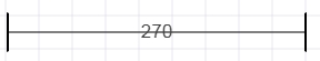
For illustrating dimensions of widgets
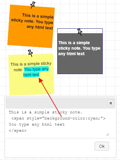
Sticky Note
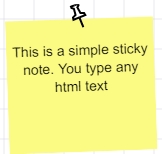
When you first drop the sticky note, it may be slightly rotated to an angle. You can change or reset the rotation on the right panel.
You can change the background color and opacity of the sticky note from the right panel. It accepts normal and html text. HTML text means any kind of html tags and style attribtues are accepted.
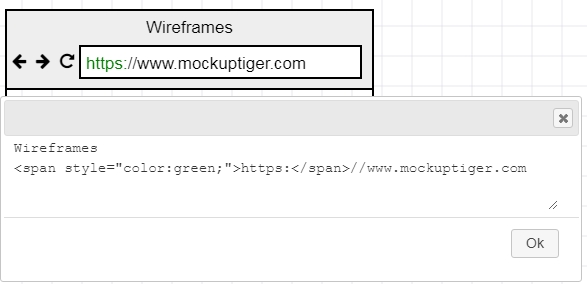
Browser Window
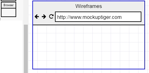
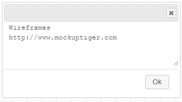
Double click will open a text box that will allow you to enter the name and the URL.
Here is a secure HTTPS example
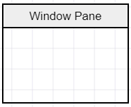
Window Pane
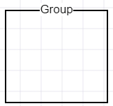
Field Set or Group
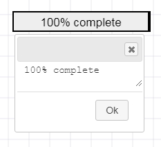
Progress bar
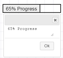
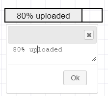
In the progress bar, you can type the percentage of progress and also what text you want to show in the progress. It is smart to parse the number and text from what you type.
Slider
Horizontal and vertical sliders used for input in dashboards. You can double click and edit the position by entering a value between 1 and 100
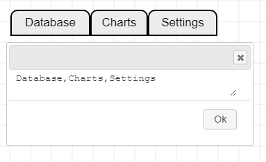
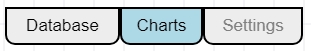
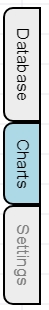
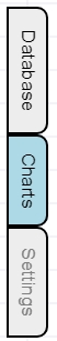
Tabs
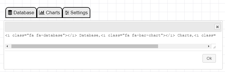
Double click and provide a comma separated list of tab names. You can embed font awesome icon tags.
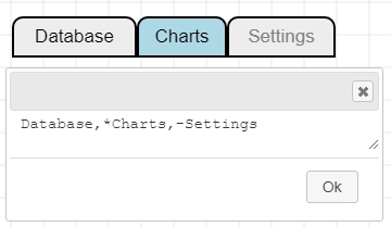
Highlighted tab is indicated with an asterisk in front and disabled tab is indicated by hyphen
How to change orientation of the Tabs
Right click on the Tab and it will provide four options
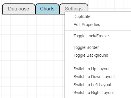
1. Up Layout: This is the default normal orientation
2. Down Layout
3. Left Layout
4. Right Layout
Tree Pane
Tree pane is another versatile widget that allows for quick mockups of hierarchical structure such as to-do list, file structure etc
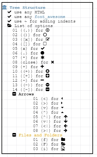
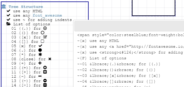
The default widget has complete index of all the shortcuts for icons. The tilde character “~” is used to create indent in the text. Every tilde will add more indentation. You can use font awesome icons or MockupTiger icons by right click method.
Radio Control

Check box Control

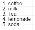
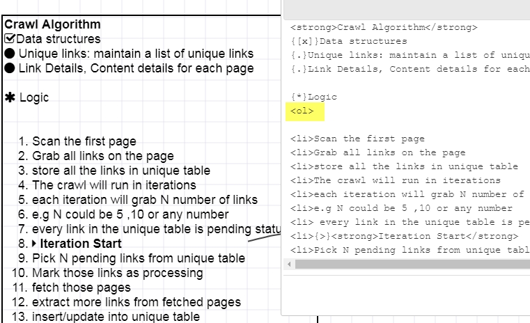
Ordered List
Annotation Number List
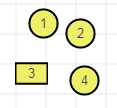
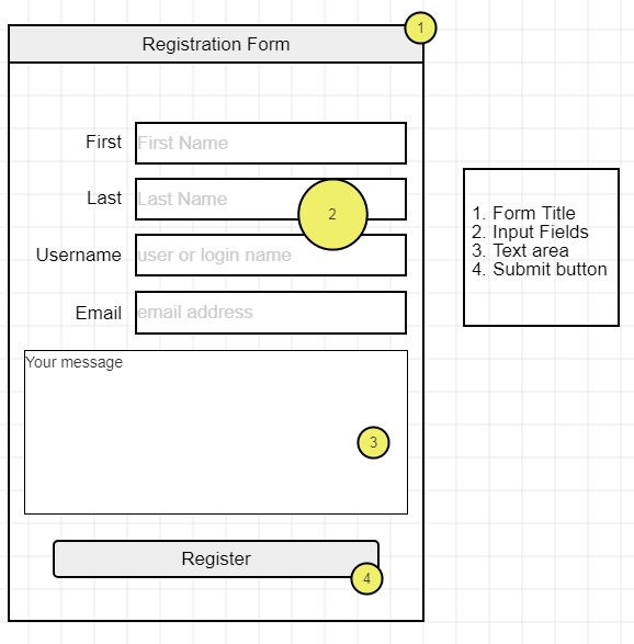
These are tiny circles with numbers that are designed specially for annotating widgets and documentation purpose. The special feature is as you drag them or duplicate the numbers increment. This allows a quick way to annotate your widgets with numbers. Along with the Ordered list, you can document the individual annotations.
Here is one example showing the annotation widgets and the use of ordered list
Ordered list can be created by using the ordered list widget or using HTML tags in the paragraph or tree pane.
By using the <ol> tag one can create numbered list
How to change the shape of the annotation widgets
1. Select the annotation circle
2. Expand the icon library on the left panel
3. Right click on any desired icon

HTML Table
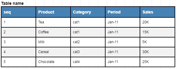
Check this detailed article on How to use Table Grids
Image widgets
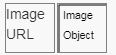
There are two image widgets. One widget takes Image URL from anywhere. The second widget uses HTML5 canvase to load the image and then allows to further manipulate the image.
HTML Widget
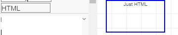
This is a pure HTML widget and you can embed any html text.
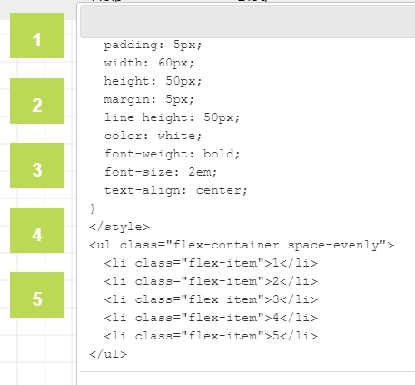
Checkout this complete custom HTML implementing flexbox where the Style is also defined in the same widget followed by the listed items
If you have a need to design a custom Grid with merged columns, merged rows, then you can think of using the plain HTML grid to mockup the table.