
Link Bar

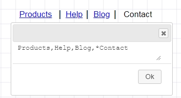
Link bar is a quick way to create a set of horizontal links separated by a pipe. You can use the asterisk * in front to indicate a clicked link and a hyphen to indicate a disabled link. Double click the widget to provide a comma separated values.
NOTE: If you happen to require comma as part of the text, then you should use the html code ,
For e.g. In the text “Hi , How are you?”, the text will be split into two items because it sees the comma as a separator. Instead you should use “Hi , How are you?”
Link Bread crumbs

This widget is similar to link bar except the link separator is a right angle indicated a trail of link path.
Navigation bar

Navigation bars are implemented in file browsers, web browsers and as a design element of some web sites.
Button Bar
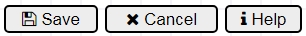
The default button bar, contains example tags for font awesome icons. This is to demonstrate the possibility of including icons within the button labels.
NOTE: MockupTiger icons can be added to almost all text. Simply open the text editor, expand the left panel for icons (e.g material design) and then right click on the desired icon. This icon’s code will be added to the cursor position in the text box.
Input Field
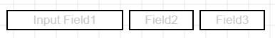
Input fields are quick way to design forms and input elements. Double click and provide a comma separated values
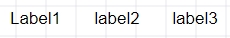
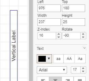
Label widget
To create a vertical label, provide a rotation angle of -90 degrees
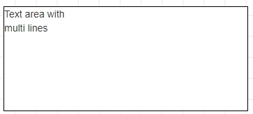
Text Area widget
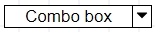
Combo box
Input Spinner

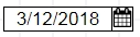
Date Field / Picker
Button Stack
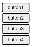
Button stack provides a quick way to stack buttons vertically
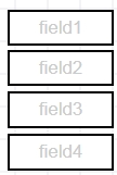
Input Field Stack
Label Stack
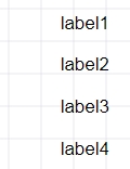
Using Button Stack, Input Field Stack and Label Stack you can create quick input form wireframes.
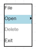
Popup menu or Context menu
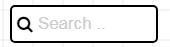
Search box Input field
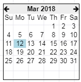
Calendar widget
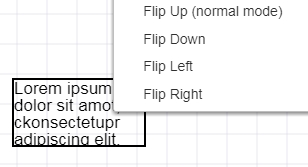
Paragraph widget
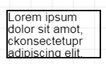
Right click on the paragraph provides quick way to change the orientation. Paragraph is a very versatile widget. Technically many other widgets are derived from paragraph and by just changing certain properties they provide a different use in the wireframing process. For e.g the Box widget is nothing but a paragraph widget with default border.
Star rating widget
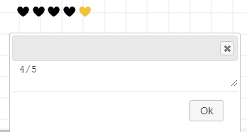
You can change the icon used in the star rating widget as follows.
1. Right click the star widget
2. Select Edit properties
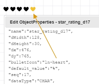
The icon name is listed in the “bulletIcon”. You can replace the name with any icon name you find on the left panel.
Icon Tray widget
Icon tray is a quick way to provide a set of icons for building parts of user interface. For e.g the tray icon on the bottom right corner of windows OS or the top bar of any mobile device can be quickly prototyped using this widget.
Double click the widget and then expand the icon set on the left panel. Then right click on the desired icon and the codes will be added in the text box.