
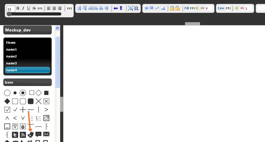
MockupTiger has a useful collection of icons that can be used in your mockups and wireframes.
All of these icons are vector Icons so you can scale them to any size without loosing any details
You drag any icon from the left panel to the center work area.
Once dragged, you can click on the icon to get it selected
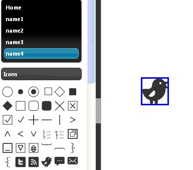
Icons now can be stretched to any size by dragging the blue border
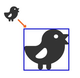
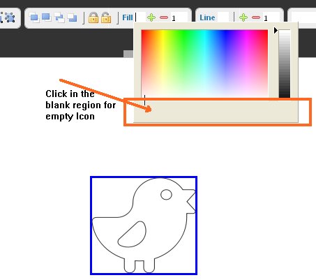
wireframe Icons can be filled with any color
Make sure the Icon is selected and then click on the top Fill color button on the top tool bar
You can also make the Icon appear without any color, just like a wireframe
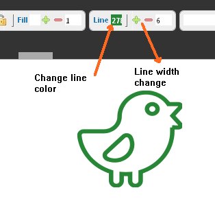
Icons line width can be changed as easily
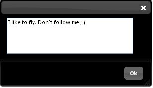
You can also add Text inside Icons. Double click to launch the edit dialog
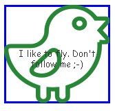
But as you see the text is aligned in the center but you can precisely position the text inside by right clicking on the icon.
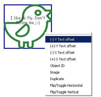
Use the Y Text and X Text offset to move around the text w.r.t icon boundary
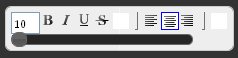
All Text strings can be manipulated using the top Text toolbar.
here is the final avtaar after some text formatting and color variations. The twitter bird is trying to make a statement using its own mockup

So the wireframe icons are very granular but important piece of the mockup puzzle. You can use Icons to acheive lot of the bulk work. For e.g the ability to embed text inside icons eleminates the need to provide a label widget that is tied to it. We do have an Icon with label widget but you would not need it as often as the icons are quiet versatile.