
Introduction
MockupTiger is a web/browser based application. It comes in ready made package that can be installed on your computer. It is also available as Cloud Wireframe application.
If you are already familiar with modern drag and drop interface then you will certainly feel home and you may not need to go through the entire user guide.
Quick Tips:
- Each and every widget, when double clicked will open a Text dialog and you can enter text to manipulate how the widget behaves.
- Right click on any widget will give you context menu for additional actions on that widget or icon
User Interface
Upon login, you will see this Launch Pad for all wireframe activities
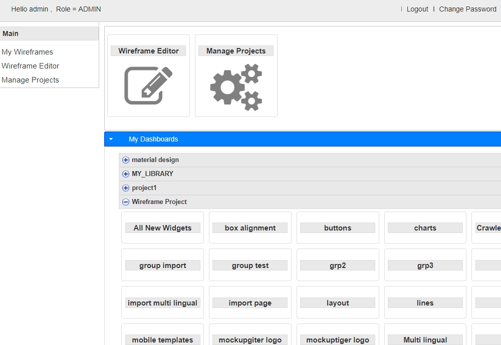
There three distinct sections in the Launch Pad
Wireframe Editor : This is the main MockupTiger editor where you will design your wireframes/mockups
Manage Projects: This is the area where you can deal with projects, assigning groups, adding users etc
My Wireframes: This is the section that lists all the wireframes that you have created and just below that you will find all the wireframes that others have shared with you
Wireframe Editor
MockupTiger Wireframe Editor is the place where you design your mockups and simple wireframes. The editor is divided into 4 sections. The top panel, left panel, right panel and the center panel.
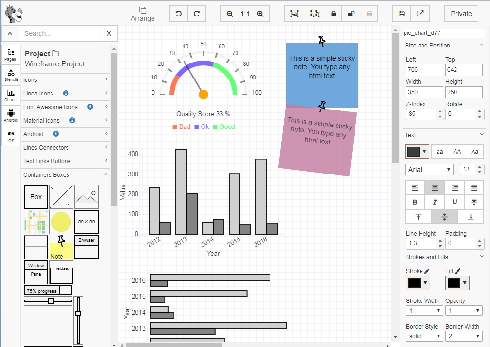
Top Panel
This section provides quick access to frequently used actions on the pages. It also provides the menu on the right to access and browse different projects etc
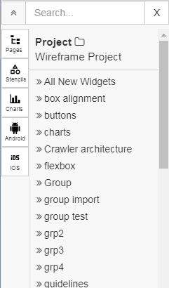
Left Panel
The left panel is where all the project and page listing is displayed. It also displays the entire icon and widget library.
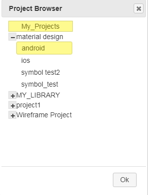
Projects and Pages
By default MockupTiger wireframes are grouped into Project. Each project consists of one or more pages corresponding to wireframes.
The left panel is divided into project section and widget/icon section. Clicking on the header of each section will expand or minimize that section.
List of pages under the project
Switching Page or Wireframe
Clicking on any page on the left panel will immediately bring that wireframe into the center canvas.
Switching to different project page
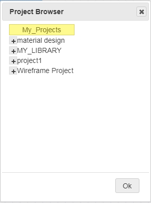
On the Top right, there is “File” menu, selecting the submenu of “Browse My Projects”
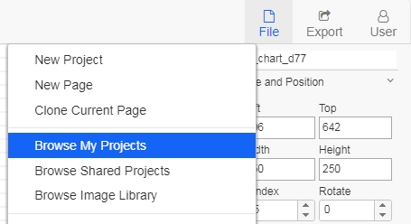
Will bring up a list of all projects and pages to pick from.
Top Panel Menu
File Menu
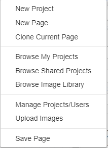
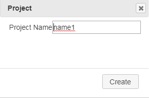
New Project: This will enable to create a blank new project.
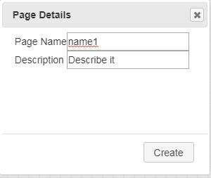
New Page: This will enable to create a blank new wireframe page under the current open project.
Clone Current Page: This will enable to duplicate or clone the current open wireframe/mockup page and also allow you to pick the target project and page name
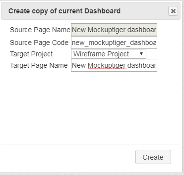
NOTE: If you cloned the wireframe into the current project then you will need to refresh the browser in order to see it.
Browse my projects: This enables you to browse and jump between other projects
Browse Shared Projects: This is applicable if you are part of a team and others have shared their project with you.
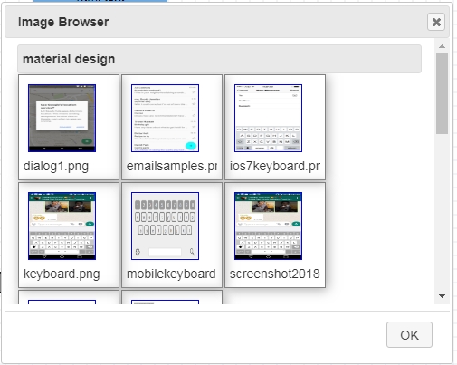
Browse Image Library: This enables you to browse all the images that you have uploaded into Mockuptiger. Images are organized into projects. Everytime you export a wireframe to PNG then that image is automatically included in your image library. You can drag and drop any image into your current open wireframe
Manage Project/Users: This is a whole another section where you manage all your projects, pages and group access.
Upload Images: This enables you to upload images to be used in your projects.
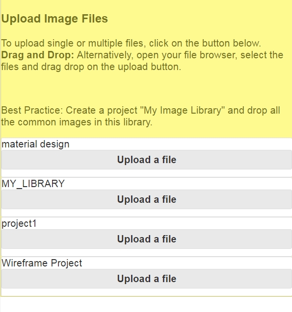
Once you upload file, you can go to the Wireframe Editor and Browse Images as explained previously.
Export Menu
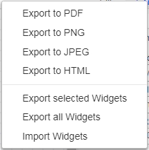
Export to PDF:
This action will produce a crisp PDF of the current wireframe that is open in the editor
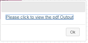
Once the PDF is ready, it will prompt you to click the link for viewing the PDF. The PDF will retain all anchor links as you may have defined in the wireframe.
Export to PNG: This action will produce a PNG image of the current wireframe.
Export to JPEG: This action will produce a JPEG image of the current wireframe.
Export to HTML: This action will produce a static HTML page. All widgets in the wireframe are converted to HTML.
Export Wireframes
Export selected Widgets: This action will allow user to individually select one or more widgets and export to an encoded string. This string can be copied and pasted directly into the same page, another page or another project or totally different installation of mockuptiger. For e.g if you wish to migrate objects from your desktop to the cloud service you can copy paste this string and transfer them.
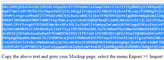
Export all Widgets: This action will export all the widgets on the current mockup/wireframe and export to an encoded string. It will ignore any selected objects
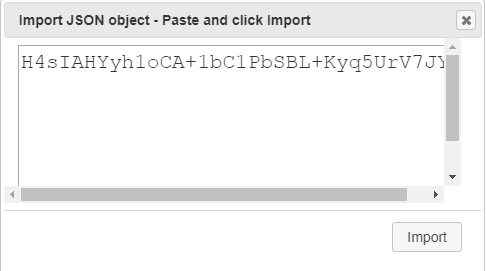
Import Widgets: This action will open a text dialog and let you paste the encoded string of previously exported widgets.
Right Panel
The panel on the right side of the editor controls attributes of individual widget. If multiple widgets are selected then you can apply changes to them all at once.
The top most field displays the widget id of the selected widget.
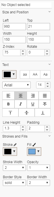
Size and Position
This section controls the position, dimension, z-index and angle of rotation. Usually the widgets can be manually dragged around and resized but if you need precise positioning and size then you can set them using this section.
Using Z-index: Arranging objects by using “Brint to Front” and “Send to Back” is good but sometimes you will need to precisely set the Z-index.
Rotate: This allows to provide an angle of rotation to individual widgets. Most of the widgets are allowed to be rotated.
Text
These are pretty standard text controls. The first color picker allows you set the Text color. You can change the case of the text to lower case, upper case or Title case.
Apart from the left, right,center alignments, you can also set the vertical alingments for the text.
Stroke and Fills
Stroke: This color is used to paint the line or the border color
Fill: This color is used to fill the background or the entire icon
Border Style allows you to pick between dashed, dotted or normal style
Connector Lines
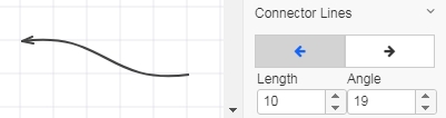
This section is visible or activated when you select a Line connector widget. It allows you to toggle left and right arrows. Also you can set the size and shaped of the arrows.
Moving and Resizing
To move any selected widget just drag it anywhere. You can also move a group of selected widgets. For finer movements, you can use the keyboard arrow keys.
Resizing is accomplished by dragging any of the borders of the widget. The widget does not need to be selected for resizing.
Grouping Widgets or creating symbols
You can select more than one widget and group them together. This is useful if you want to keep a bunch of elements together for e.g designing a Form or a collection of widgets.
The benefit of grouping is that you can resize the parent border to scale all the widgets that are part of the group. You can edit the group elements by double clicking and entering in edit mode.
Once you are done editing then simply clicking on the canvas will lock the group. During editing you can even move around elements and resize them.
Grouping objects can included nested groups as well.
The grouped objects are usually used for creating symbols. Infact, the Android or iOS stencil is completely made by grouping widgets.
Working with Text widgets and Editing text
The wireframe widgets are very versatile and allows you to enter any kind of text including HTML content. You can use the Text formatting on the right hand panel to control the look and feel of the text.
The formatting can be enhanced by using pure HTML style attribute.
Simply double click the widget and a text dialog opens up. Enter the desired text and click OK.
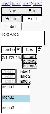
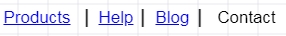
Link Widget: Drag the widget to the center canvas and it creates a default link bar
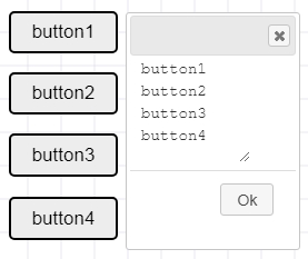
Double click and you can edit the text separated by comma
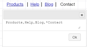
Similarly all the horizontal text widgets work the same way, the text is separated by comma
The vertical text widgets are separated by a new line character
Stretching the widget
For horizontal widgets, stretching horizontally will evenly spread them
For vertical widgets, stretching vertically will evenly spread them vertically by adding more or less white space between them
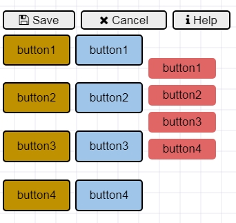
You can format the color by toggling the background color of each widget, change the sroke color and background color
You can also embed font awesome tags to embed icons with your buttons or text elements
Example of a button with icons
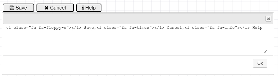
<i class=”fa fa-floppy-o”></i> Save,<i class=”fa fa-times”></i> Cancel,<i class=”fa fa-info”></i> Help
Duplicating or Cloning Widgets
It is just a right click operation to duplicate or clone a widget. Every widget has a context menu option to “Duplicate”. If you need to duplicate or clone multiple objects then simply select all and then press “Ctrl+C” and “Ctrl+V”.
This “Ctrl+C” operation is a server side clipboard. So the benefit is that you can paste across different project or pages. Another easy way to clone widgets is to use the “Export Wireframe widgets” option. This export to text string can be used to clone objects across different installation of the mockuptiger software or between desktop and cloud service.
Linking Wireframes or adding external links
MockupTiger keeps the standard way of adding HTML links using anchor tags. Since all the text allows you to add HTML content, you can simply use anchor tags to add any links to the anchor text.
How to get URL of any wireframe
Each and every wireframe is reachable by its own URL and this can be acquired using the following methods.
1. To add link to any widget, just double click and open the text window.
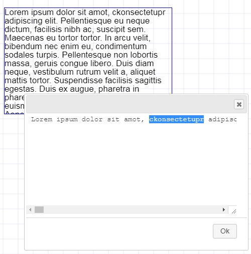
2. Select the text that you want to link
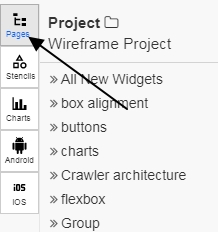
3. Next, expand the Project and pages on the Left panel
4. Right click on the page that you want to link with the selected text
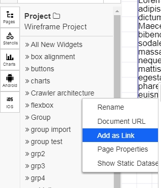
It will open a context menu and then select ‘Add as Link’
This action will add HTML anchor link to the text.
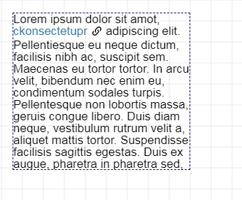
The selected text is shown along with a link icon indicating that word is linked.
If you need to remove the link icon or replace with another icon, simply edit the text and remove the icon tag