After looking at the below screenshots, it may seem as if this is not a mockup application but a real dashboard application. But it is not. It is still a dashboard mockup application. Although you could use it as a static dashboard but then you would have to manually update the data to reflect changes in the charts and gauges, yes gauges!
Here comes the first mockup application to have Dashboard Gauges. Gauges are frowned upon by visualization evangelist as bad choice for data presentation. But who cares, dashboard users always need Gauges and fancy dials for higher managerial reporting.
As long as people find dashboard useful for their businesses, gauges and dials are here to stay. Stephen Few may not like it but don’t worry we will deliver the bullet charts too that you are fond of 🙂
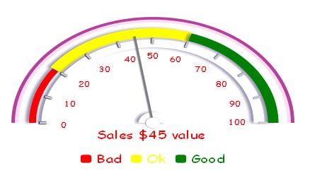
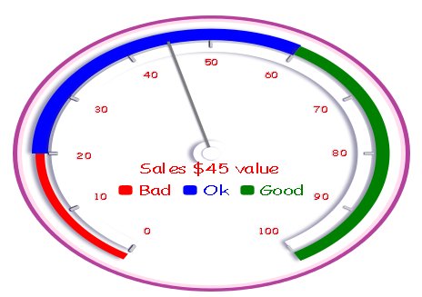
There are number of ways you can customize the dials, right from the number of ranges, color of each range, pointer size and value.
Here are the options
“range_min_max”:[0,100],
“ticks_angle_min_max”:[180,360],
“range_legend”:[“Bad”,”Ok”,”Good”],
“ranges”:[ [0,20],[20,60],[60,100],[0,100] ],
“range_color”:[“red”,”yellow”,”green”,”white”],
“value_template”:”Sales $# value “,
“pointer_value”:[45],
“arc_angle”:[180,360],
“arc_radius”:[-5,-10,-20,20],
“arc_color”:[“#FFDDEE”,”white”,”white”,”white”],
“tick_radius”:[-50],
“tick_number_radius”:[-70],
“tick_length”:[10],
“tick_width”:[3],
“range_radius”:[-30,-30,-30,-50],
“range_thickness”:[10,18,15,15],
“value_display”:[0,15],
“value_font_size”:6,
“pointer_radius”:[-35],
“pointer_width”:[3],
“pointer_color”:[“#7D7D7D”],
“legend_display”:[0,60]
In the same tone, let us introduce the Ratings widget

As usual you can change the font and icons that represent the ratings.
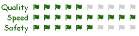
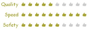
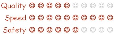
You can choose any icon from our icon library (around 200+ icons, woah!)
And here is how simply you can define multi line ratings widget, just like that! How snappy, huh?
Just add more labels to the array and define the max and the actual count. This also is a good gauge gadget that can be used for data visualization.
“labels”:[“Quality”,”Speed”,”Safety”],
“label_width”:120,
“count”:[ 5.5,10,6 ],
“count_max”:[ 10,10,10 ]
Over the coarse, we will be inventing lots of data visualization gadgets as with HTML5 Canvas SKY is really the limit!
So are we close towards acheiving the “Best HTML5 Dashboard Mockup, Prototyping and Wireframing application” award? Nope?? no worries, we will keep working on it until you say